Spectral energy density#
In this example we will study the spectral energy density of a crystal.
The simple spectral energy density (SED) method for crystals is implemented in dynasor as a complement to the autocorrelation functions (ACFs). In this method the information about the crystal structure is included in the analysis. The method is very similar to the velocity autocorrelation method (VACF). The results from SED typically converge comparably fast and features of interest are sometimes more visible. The drawback is that it only works for perfect crystals.
This example will demonstrate how to compare the dispersion as obtained from zero Kelvin lattice dynamics theory using phonopy with fully anharmonic molecular dynamics (MD) simulations using GPUMD. Some theoretical background can be found in the theory section of the documentation.
dynasor supplies a function to calculate the spectrum at any given q-point. In practice any q-point can be supplied but due to aliasing, spurious frequencies will arise at q-points which are not at the exact inverse supercell lattice. For simple diagonal repetitions it is easy to find these points. The difficulty arises when the supercell is not a simple repetition of the primitive cell. To aid in these types of situations dynasor provides some helper functions.
The
Latticeobject is a map between the primitive cell and the supercellThe
make_pathmethod returns exact, commensurate q-points along a given path in the Brillouin zone.
In the following example graphite is used since the 2D character makes it easy to visualize the concepts in the x-y/a-b plane.
Note that although this example uses ase, calorine, gpumd and phonopy none of these packages are strictly needed.
Input data#
You can find the input files as well as example output files in this Zenodo repository. You can fetch these files, e.g., by executing the following cell.
[1]:
!wget https://zenodo.org/records/17858255/files/graphite.xyz
!wget https://zenodo.org/records/17858255/files/nep-C-CX.txt
...
Setup and visualization of structures#
We can use ase to read the graphite primitive structure located in the example directory.
[2]:
from ase.io import read

prim = read('graphite.xyz')
print(prim)
Atoms(symbols='C4', pbc=True, cell=[[2.46748, 0.0, 0.0], [1.23374, 2.1369, 0.0], [0.0, 0.0, 6.554959]])
As we can see the cell vectors point in the x-direction and at a 60-degree angle as expected. To make things a bit more challenging we will use an orthorhombic unit cell instead of the hexagonal primitive cell.
[3]:
unitcell = prim.copy()
unitcell = unitcell.repeat((1, 2, 1))  # repeat cell along b-axis
cell = unitcell.cell
cell[1] -= cell[0]  # remove one unit of a-axis from b-axis
unitcell.set_cell(cell)
unitcell.wrap()
print(unitcell)
Atoms(symbols='C8', pbc=True, cell=[2.46748, 4.2738, 6.554959])
As we can see the cell is now orthorhombic. ASE provides a simple tool to visualize atomic structures with ase.visualize.view(prim).
Lastly we can construct a larger supercell suitable for molecular dynamics simulations
[4]:
dim = (6, 6, 2)
supercell = unitcell.repeat(dim)
print(supercell)
Atoms(symbols='C576', pbc=True, cell=[14.80488, 25.642799999999998, 13.109918])
Now let’s visualize these structures using matplotlib.
[5]:
from matplotlib import pyplot as plt
import numpy as np

fig, ax = plt.subplots()

ax.set_title('Real')
ax.set_xlabel('x position (Å)')
ax.set_ylabel('y position (Å)')
ax.set_aspect('equal')

# Finds corners of cell
make_box = lambda cell:([[0,0],[1,0],[1,1],[0,1],[0,0]] @ cell).T

x, y = make_box(supercell.cell[:2, :2])
ax.fill(x, y, facecolor='tab:green', alpha=0.5)

x, y = make_box(unitcell.cell[:2, :2])
ax.fill(x, y, facecolor='tab:orange', alpha=0.5)

x, y = make_box(prim.cell[:2, :2])
ax.fill(x, y, facecolor='tab:blue', alpha=0.5)

# plot the atoms in the bottom graphene layer as black dots
x, y, z = supercell.positions.T
bottom_layer = np.isclose(z, z.min())
x, y = x[bottom_layer], y[bottom_layer]
ax.plot(x, y, 'o', color='k')

fig.tight_layout()
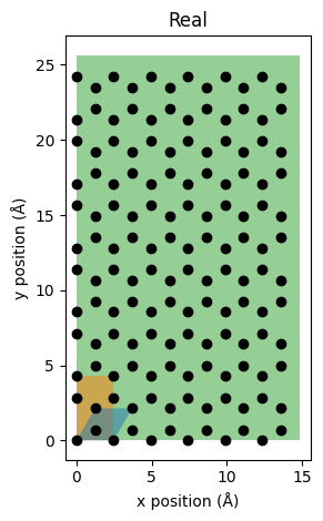
The above figure uses an equal aspect ratio so we can see the perfect honeycomb pattern of the bottommost graphene layer. The blue cell indicates the primitive cell, the orange cell indicates the unit cell, and the green cell indicates the supercell.
Phonopy calculations#
Next we use phonopy and calorine to generate the phonon dispersion of graphite. First we use calorine to set up an ase calculator.
[6]:
from calorine.calculators import CPUNEP

model_fname = 'nep-C-CX.txt'
calc = CPUNEP(model_fname)
prim.calc = calc
Next we use calorine to set up the phonon object. Note that we will use the same dimensions as the supercell but in principle as long as the there are no periodic image interactions any dimension can be used.
[7]:
from calorine.tools import get_force_constants, relax_structure

phonon = get_force_constants(prim, calc, [6, 6, 2])
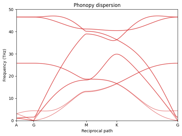
We are now ready to generate the dispersion. We will generate our own path in the Brillouin zone. Remember that the coordinates correspond to scaled positions of the inverse primitive cell. For example, (1/2, 0, 0) would correspond to a wave at the Brillouin zone boundary traveling in the direction perpendicular to the b and c axes of the real cell.
[8]:
path = 'AGMKG'
special_points = dict(
    A = [0,   0,   1/2],
    G = [0,   0,   0  ],  # Gamma point
    M = [0,   1/2, 0  ],
    K = [1/3, 2/3, 0  ])

path_list = []
for start, stop in zip(path[:-1], path[1:]):
    start = special_points[start]
    stop = special_points[stop]
    path_list.append(np.linspace(start, stop, 100))

phonon.run_band_structure(path_list)

band = phonon.get_band_structure_dict()
phonopy_freqs = band['frequencies']
phonopy_paths = band['qpoints']
phonopy_dists = band['distances']
We are now ready to plot the dispersion from phonopy.
[9]:
fig_phonopy_dispersion, ax = plt.subplots()

ax.plot(np.hstack(phonopy_dists), np.vstack(phonopy_freqs), color='tab:red', alpha=0.5)

ax.set_title('Phonopy dispersion')
ax.set_xlabel('Reciprocal path')
ax.set_ylabel('Frequency (THz)')

xticks = [d[0] for d in phonopy_dists] + [phonopy_dists[-1][-1]]
ax.set_xticks(xticks)
ax.set_xticklabels(list(path))
ax.set_xlim(xticks[0], xticks[-1])
ylim = (0, 50)
ax.set_ylim(ylim)

fig_phonopy_dispersion.tight_layout()
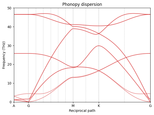
Now we want to create the same dispersion using MD. The problem is that not all of the q-points in the above dispersion are supported by our choice of supercell. All points between are in some sense interpolated. q-points at exact inverse supercell lattice points are always exact and points between are exact only if the force constants decay to zero within the supercell (a.k.a. the L/2 criterion).
dynasor supplies two helper functions to find these exact q-points. The Lattice object represents the map between the primitive cell and the supercell. It will provide us with the P matrix. The make_path method can find exact points along a straight path in the Brillouin zone. It returns those points and fractional distances along the path. This approach is a step by step way to generate the q-points, which we here use for clarity, but dynasor also has a helper function
get_supercell_qpoints_along_path that can be used instead to obtain the q-points in the supercell (see, e.g., the FCC-Al tutorial).
[10]:
# get qpoints
from dynasor.qpoints.lattice import Lattice

lat = Lattice(prim.cell, supercell.cell)

dyna_paths, dyna_dists = [], []
for p, d in zip(phonopy_paths, phonopy_dists):
    p0, p1 = p[[0, -1]]

    dyna_path, dyna_dist = lat.make_path(p0, p1)
    dyna_paths.append(dyna_path)

    d0, d1 = d[[0, -1]]
    dyna_dists.append(d0 + (d1 - d0) * dyna_dist)
We can now update the dispersion with the exact q-points.
[11]:
ax = fig_phonopy_dispersion.get_axes()[0]
for x0 in np.hstack(dyna_dists):
    ax.axvline(x0, 0, 1, ls=':', color='gray', alpha=0.4)
fig_phonopy_dispersion
[11]:
To get a better feel for how the real and inverse/reciprocal cells relate we can plot them as we did for the real space case.
First we need to convert our paths and inverse lattice points to Cartesian coordinates.
[12]:
qpoints_supercell = lat.qpoints
phonopy_path = lat.reduced_to_cartesian(np.vstack(phonopy_paths))
dynasor_path = np.vstack(dyna_paths)
Now let us plot them
[13]:
fig, ax = plt.subplots()

# plot the blue Brillouin zone
ax.fill(*make_box(lat.reciprocal_primitive[:2, :2]), facecolor='tab:blue', alpha=0.3)

# plot red phonopy path
ax.plot(phonopy_path[:, 0], phonopy_path[:, 1], '-', color='tab:red')

# plot all supercell lattice points
ax.plot(qpoints_supercell[:, 0], qpoints_supercell[:, 1], 'o', color='tab:green')

# plot all points along path
ax.plot(dynasor_path[:, 0], dynasor_path[:, 1], 'o', color='tab:red')

ax.set_aspect('equal')
ax.set_title('Reciprocal')
ax.set_xlabel('x direction (rad/Å)')
ax.set_ylabel('y direction (rad/Å)')

# Annotate the special points
for label in path:
    lp = special_points[label]
    if not np.isclose(lp[2], 0):  # skip the A-point
        continue
    q = lat.reduced_to_cartesian(lp)
    ax.annotate(label, q[:2])

fig.tight_layout()
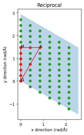
The blue cell is now the inverse primitive cell. Notice how the reciprocal a-axis is perpendicular to the real b- and c-axes (the c-axis is directed towards us with the A point above the gamma point G). The green dots indicate all q-points which are spanned by our supercell. They represent all supported waves and, as expected since the real supercell is shorter in the x/a direction, the inverse supercell lattice is sparser in that direction. The red path is the infinite limit taken by phonopy and the red circles are the inverse supercell lattice points along this path. Evidently as we change the supercell we can make the sampling denser or sparser or completely miss the special high-symmetry points. It is also possible to make use of lattice symmetries to combine points from different but symmetrically equivalent paths to further increase the statistics and/or density of points along a path of interest. Notice for example if we went along the symmetrically equivalent inverse a-axis we would only get two points instead of five points between the gamma point and the zone boundary. On the other hand we would get three points for the (K-G) path instead of one. This optimization is left as an exercise.
Molecular dynamics simulations#
We are now (finally) ready to make the dispersion using MD and the SED method.
We will use gpumd for this purpose and the first step is to write a suitable input file. The most important parameters are dump and time_step. They control the maximum frequency we can resolve in the simulation, which should be higher than the maximum frequency in the dispersion. GPUMD uses femtoseconds as the time unit, and with a dump frequency of once every 10 timesteps the maximum frequency is given by 0.5 / (dt * dump) petahertz, which equals 50 terahertz, just above our maximum
frequency from phonopy.
Remember to remove any old trajectories before starting a new simulation.
If you have gpumd installed the following cell will take less than a minute to run on common consumer GPUs.
[14]:
%%time

from calorine.calculators import GPUNEP

dt = 1.0  # time step in fs
dump = 10  # number of steps between configuration is written
temperature = 300  # target temperature in K
steps = 10 ** 4  # number of steps to run

calc = GPUNEP(model_fname, directory='gpumd_run_dir')
supercell.calc = calc

parameters = [('time_step', dt),
              # equilibration
              ('velocity', 2 * temperature),
              ('ensemble', ('nvt_lan', temperature, temperature, 100)),
              ('run', steps // 10),
              # production
              ('ensemble', 'nve'),
              ('dump_exyz', (dump, 1)),  # the "1" requests to also write the velocities
              ('run', steps)]
calc.run_custom_md(parameters)
CPU times: user 8.59 ms, sys: 17.2 ms, total: 25.8 ms
Wall time: 38.7 s
The SED function is simply invoked as follows. The ideal and primitive structures must be provided in order to correctly map atoms to primitive cells. Also notice that the q-points are given in angular units and the resulting frequency vector w is an angular frequency.
[15]:
%%time

from dynasor import Trajectory, compute_spectral_energy_density
from dynasor.units import radians_per_fs_to_THz

traj = Trajectory(f'{calc.directory}/dump.xyz', trajectory_format='extxyz')

w, sed = compute_spectral_energy_density(
        traj,
        ideal_supercell=supercell,
        primitive_cell=prim,
        q_points=dynasor_path,
        dt=dt*dump)

freqs = w * radians_per_fs_to_THz  # radians/fs to cycles/ps (THz)
INFO 2025-12-08 18:00:25: Assuming the trajectory has the default length unit (Ångström), since no unit was specified.
INFO 2025-12-08 18:00:25: Assuming the trajectory has the default time unit (fs), since no unit was specified.
INFO 2025-12-08 18:00:25: Trajectory file: gpumd_run_dir/dump.xyz
INFO 2025-12-08 18:00:25: Total number of particles: 576
INFO 2025-12-08 18:00:25: Number of atom types: 1
INFO 2025-12-08 18:00:25: Number of atoms of type X: 576
INFO 2025-12-08 18:00:25: Simulation cell (in Angstrom):
[[14.80488   0.        0.      ]
 [ 0.       25.6428    0.      ]
 [ 0.        0.       13.109918]]
INFO 2025-12-08 18:00:25: Running SED
INFO 2025-12-08 18:00:25: Time between consecutive frames (dt * frame_step): 10.0 fs
INFO 2025-12-08 18:00:25: Number of atoms in primitive_cell: 4
INFO 2025-12-08 18:00:25: Number of atoms in ideal_supercell: 576
INFO 2025-12-08 18:00:25: Number of q-points: 15
INFO 2025-12-08 18:00:25: Number of snapshots: 1000
CPU times: user 2.09 s, sys: 795 ms, total: 2.89 s
Wall time: 2.12 s
Now we can plot the dispersion along with the one from phonopy.
[16]:
# Plot
fig, ax = plt.subplots()

# dynasor
ax.pcolormesh(np.hstack(dyna_dists), freqs, np.log(sed).T,
              shading='auto', rasterized=True)

# phonopy
ax.plot(np.hstack(phonopy_dists), np.vstack(phonopy_freqs), color='tab:red', alpha=0.4)

# indicate q-points that were sampled
ax.vlines(np.hstack(dyna_dists), 0, 50, color='gray', alpha=0.5)

ax.set_xlabel('Reciprocal path')
ax.set_ylabel('Frequency (THz)')
ax.set_xticks(xticks)
ax.set_xticklabels(list(path))
ax.set_ylim(ylim)

fig.tight_layout()
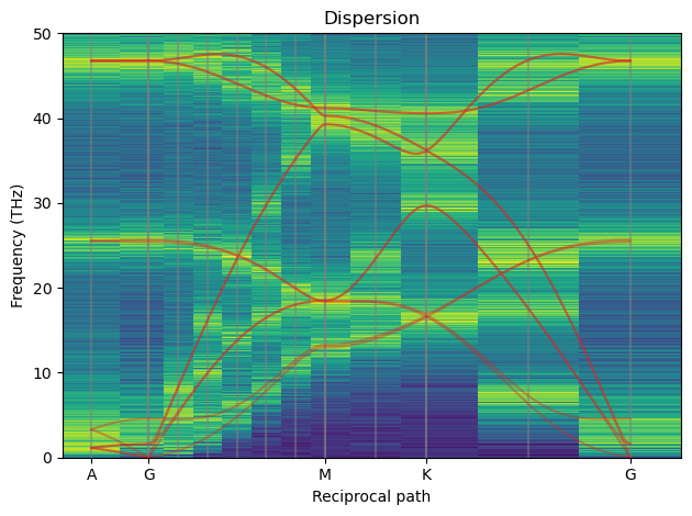
The red line is the “exact” 0 K phonopy dispersion. The gray vertical lines are exact supercell inverse lattice points and the only consistent points to consider. The vertical stripes are the results from SED and only carry meaning at the gray lines. As we can see where the red and gray lines meet we have a high intensity from SED which is as expected.
Below is a dispersion for a 24x24x8 system at 900 K simulated for 1 ns,

It is also possible to plot slices at different q-points separately.
[17]:
special_indices = np.cumsum([0] + [len(d) for d in dyna_dists])[:-1]

fig, ax = plt.subplots()

for label, spectrum in zip('AGMK', sed[special_indices]):
    ax.semilogy(freqs, spectrum, label=label, alpha=0.7)
ax.set_xlim(0, 50)
ax.set_xlabel('Frequency (THz)')
ax.set_ylabel('Spectral energy density (eV / (rad/fs))')
ax.legend()

fig.tight_layout()
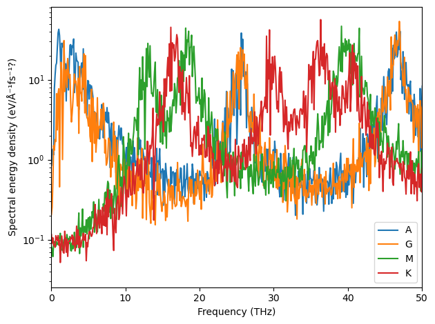
Below follow the equivalent converged spectra.

1/2 * n_bands * kB * T in units of eV, as you can see below.[18]:
# SED normalization test
from ase.units import kB

n_bands = len(prim) * 3
print('Number of bands', n_bands)
for label, spectrum in zip('AGMK', sed[special_indices]):
    I = np.trapz(spectrum, w)
    T = I / (1 / 2 * kB * n_bands)
    print(f'q-point {label}: SED temperature {T:.2f} K')
Number of bands 12
q-point A: SED temperature 350.07 K
q-point G: SED temperature 215.15 K
q-point M: SED temperature 295.22 K
q-point K: SED temperature 241.17 K
Partial spectral energy density#
It is also possible to decompose the resulting SED by atom type and by Cartesian direction. This is achieved by setting partial=True in the compute_spectral_energy_density function.
Here, as an example the resulting partial SED for the SrTiO3 cubic perovskite is shown. The top panel shows the full SED, the middle panel shows the SED decomposed by atom type, and the final row shows how motion in the different Cartesian directions contributes to the SED for Sr atoms.
